I admire designers who creatively use negative space in letterforms.
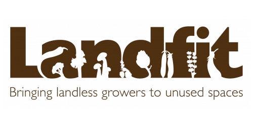
Landfit matches people who have gardens that they don’t use with people who don’t have gardens who want to use that space to grow flowers, herbs and vegetables. The logo is perfect! They use the “unused space” of letterforms and grown vegetables, herbs and flowers 🙂

David Airey has compiled a collection of these kind of logos in his Logo Design Love. Here are some of my favorites.

Egg n Spoon logo by Thoughtful

Elefont logo by LogoMotive Design

Guild of Food Writers logo by 300Million

Conception logo by The Chase

American Institute of Architects Center logo by Pentagram

The Brand Union logo by The Brand Union

ED logo by Gianni Bortolotti
1 Comment
Add comment Cancel reply
This site uses Akismet to reduce spam. Learn how your comment data is processed.
galing,,,,hehehe